Curious about our universe.
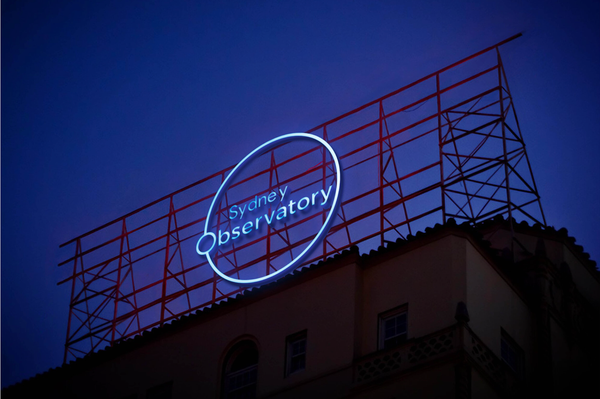
The Sydney Observatory, part of the Museum of Applied Arts and Sciences (MAAS), is a state-listed heritage site home to Australia’s most accessible telescope domes, a 3D Space Theatre and the Sydney Planetarium. Unlike the Powerhouse Museum also under MAAS this space lacks an effective brand or identity. This project aims to establish a visual identity for the Sydney Observatory and bring the branding into the modern day to capture the attention of a new audience.
The identity utilises clean modern typefaces, a pop of colour as well as simple graphics to add fun visual elements whilst keeping it minimalistic.
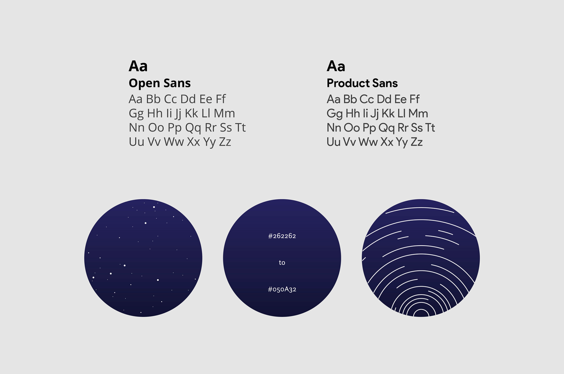
The primary typography chosen is Open Sans a modern type that fits with the new aesthetic of the Sydney Observatory whilst also accentuating and complimenting the secondary typeface of Product Sans.
The new Sydney Observatory branding incorporates a dark blue gradient to emulate the night sky. The gradient starts with a lighter #262262 at the top transitioning into the darker #050A32.
On top of the gradient, graphic elements such as meteor shower streaks or small stars can be added on top to add more life and visual interest to the gradient making it appear more like a night sky.
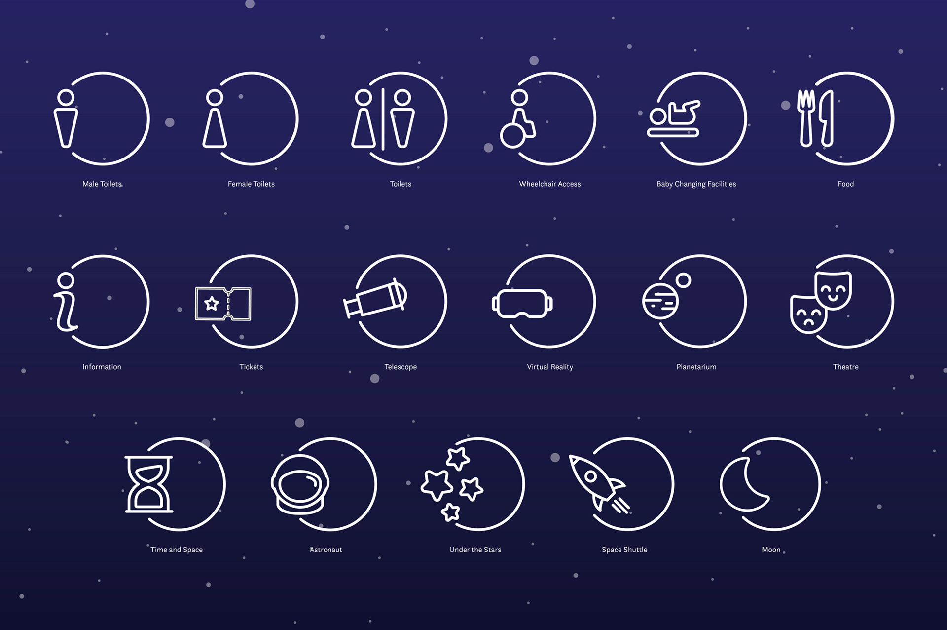
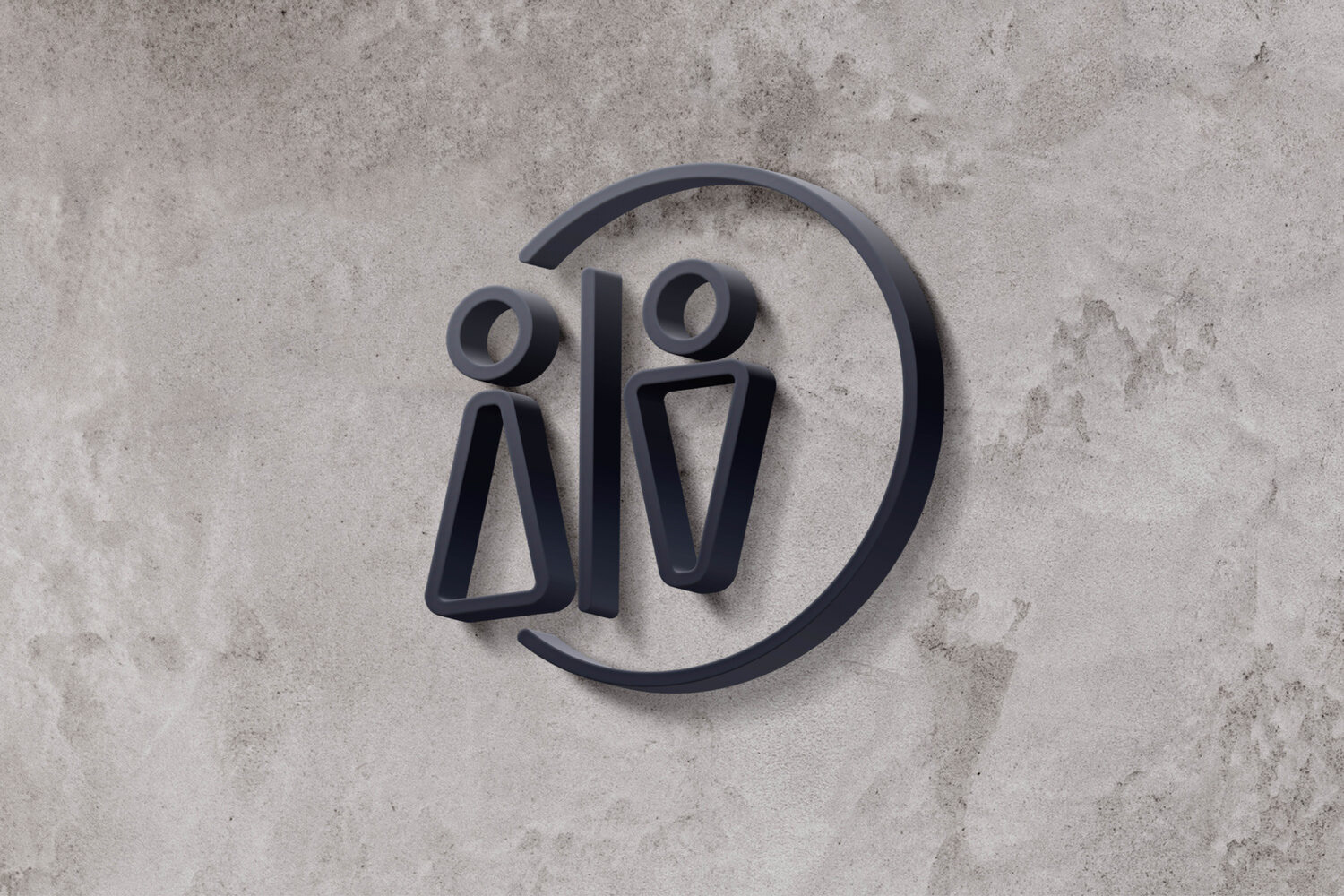
Minimalistic pictograms to represent the different attractions and facilities around the Sydney Observatory which can be used as additional signage on walls. The design of the pictograms is a fun play on the Sydney Observatory logo and keeps the branding and visual identity consistent.
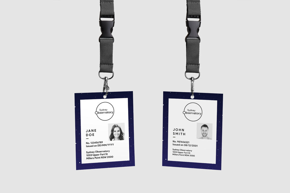
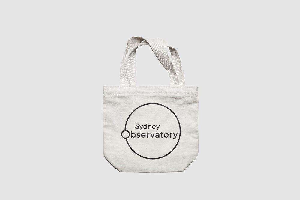
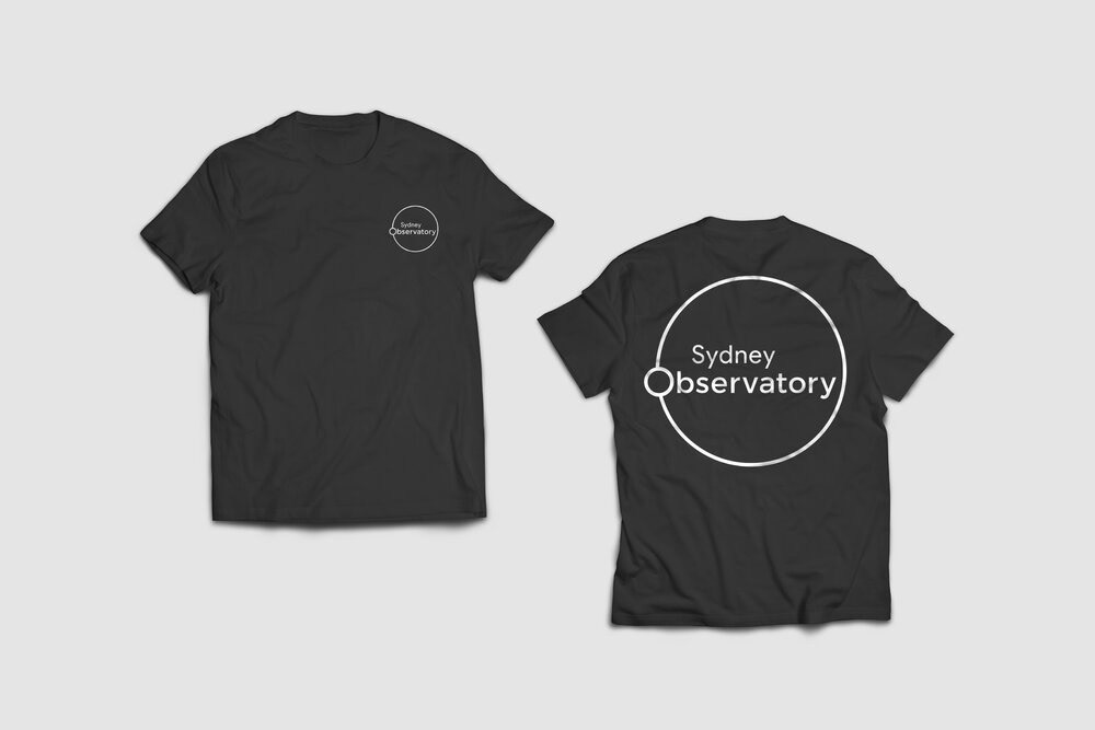
Employees will have new ID cards making it easy for visitors to discern who to seek for help. The ID cards provide another avenue for the Sydney Observatory’s branding to be further established and ingrained in the audience. Visitors will be able to purchase merchandise such as tote bags and t-shirts that feature the logo and further promote the observatory.
Sydney Observatory
Advertising, Branding & Identity, Merchandising, Pictograms
2018